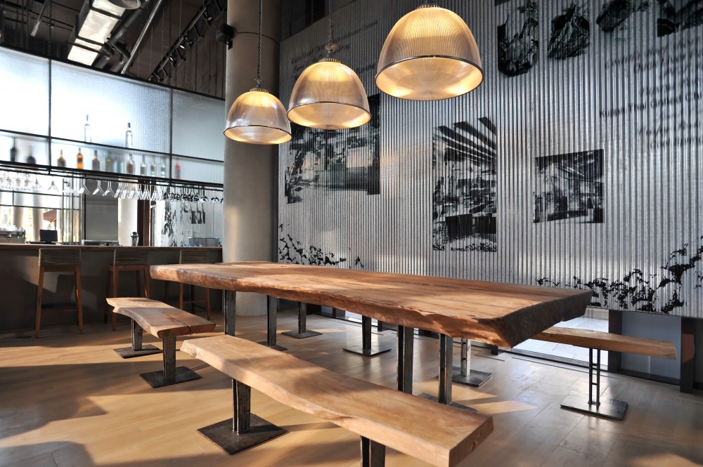
You must have heard of color combinations that work wonders in commercial or personal spaces. In the world of restaurants, appearances matter a great deal, and customers often judge an eatery by its aesthetics. The right color scheme or a well-chosen wallpaper can transform a restaurant, potentially increasing its footfall significantly. However, it's essential to be aware that not all color combinations are created equal. In fact, some are so horrifically bad that you'd want to steer clear of them if you care about the success of your business.
If you ever thought of these designs, banish them from your color palette right now! And better yet, call the professional squad whenever you are thinking of doing a good job for your commercial space.
1. Blue and Green
Blue and green, while individually pleasant colors form a combination that should generally be avoided in restaurant design. The reason lies in the curious effect these colors have on our appetites—they tend to suppress them. When you combine blue and green, you risk creating an environment that feels cold and sterile, far from the warm and inviting ambiance that diners crave. The result? Your customers might find it challenging to savor their meals, and you could unwittingly discourage repeat visits.
2. Black and Brown
Black and brown, when used together, can conjure an atmosphere that is excessively dark and heavy, akin to a medieval dungeon. Such a gloomy and oppressive ambiance is far from conducive to relaxation or pleasant conversation, both of which are crucial for a positive dining experience. While some may seek a cozy and intimate setting, this color combination often crosses the line into discomfort. Unless you want a special dungeon-themed restaurant, then go ahead and make your restaurant like a prison. But trust us, this color scheme would rather make you repel visitors than attract any.
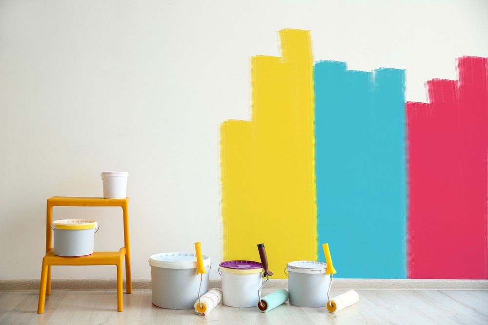
3. Neon Colors
Neon colors, with their bold and eye-catching hues, might seem like an exciting choice for restaurant decor at first glance. However, it's crucial to consider the impact of these vibrant shades on the overall dining experience. Neon colors are known for their stimulating and overwhelming nature, which can be unsuitable for those seeking a relaxing meal.
In a restaurant, the primary goal is to provide an environment where customers can enjoy their food and engage in conversation comfortably. Neon colors, on the other hand, have the potential to disrupt this harmony. They can be distractingly bright and create a sense of chaos, making it difficult for diners to focus on their meals and conversations.
Imagine a restaurant with neon pink and green walls—the visual assault of such colors can overwhelm the senses, leaving patrons feeling more agitated than delighted. While some may argue that neon colors can create a lively atmosphere, it's important to strike a balance between vibrancy and comfort to ensure that customers have a pleasant dining experience.
4. Clashing Colors
Another pitfall in restaurant design is the use of colors that clash with each other. While contrast can be visually appealing when used thoughtfully, going overboard with clashing colors can result in an unpleasant and jarring visual experience.
When colors clash, they create a sense of disharmony that can be visually unsettling. It's akin to trying to enjoy a peaceful meal while listening to conflicting music at high volume—it disrupts the overall experience. The space can start to feel visually cluttered and overwhelming, detracting from the desired ambiance of the restaurant.
In the quest to stand out and be unique, it's essential to exercise restraint and consider the overall impact of color choices. While bold and contrasting colors have their place in design, using them sparingly and thoughtfully ensures that they enhance rather than detract from the dining experience.
5. Unnatural Food Colors
While creativity in restaurant design is commendable, there's a fine line between imaginative and off-putting. One design choice that often falls into the latter category is the use of unnatural food colors. These are the bright blues and purples that are rarely found in the natural world of food. While they might seem like a fun idea, they can have adverse effects on the dining experience.
The main issue with unnatural food colors is that they can make the food itself look unappetizing. Imagine being presented with a plate of bright blue pasta or vivid purple mashed potatoes. Instead of tantalizing your taste buds, such colorful concoctions might trigger a subconscious aversion, leading to a decreased appetite.
In the quest for unique and attention-grabbing aesthetics, it's essential to remember that the appearance of the food matters as much as its taste. The goal is to create a dining atmosphere that encourages patrons to savor their meals, not one that makes them hesitate before taking a bite.
Consider These Color Alternatives
When it comes to choosing the right colors for your restaurant's ambiance, there are alternative options that have been proven to enhance the dining experience. Here are some color categories to consider:
1. Appetizing Colors
Colors such as red, orange, and yellow are renowned for their ability to stimulate appetite and create a sense of warmth and excitement. Incorporating these hues into your restaurant's decor can entice diners and make them eager to enjoy their meals. Restaurants that want to encourage patrons to indulge and savor their dishes often find these colors to be effective.
2. Relaxing Colors
On the other end of the spectrum, you have colors like green, blue, and brown. These shades can have a calming effect and promote a sense of tranquility. They are particularly well-suited for restaurants seeking to create a more casual and relaxed atmosphere. Patrons can unwind, engage in conversation, and enjoy their dining experience without the distractions of overly vibrant colors.
3. Sophisticated Colors
For fine dining establishments aiming to exude elegance and refinement, colors like black, white, and gray are ideal choices. These neutral tones create a timeless and sophisticated look, elevating the overall atmosphere. Fine dining patrons often expect a level of sophistication in both the cuisine and the surroundings, and these colors can help achieve that.
Incorporating these alternative color options into your restaurant's design can contribute to a more harmonious and enjoyable dining experience, aligning with your establishment's theme and goals. Remember, the right color scheme can play a significant role in creating the ambiance you desire, making it an essential element of your restaurant's success.